
Siedle system design extends beyond product design and defines the entire company. This consistent approach has won Siedle more than 70 prestigious design awards and made it one of the most important German design brands.
Siedle products present numerous different versions based on the modular principle. The principle of the open system also has an impact on the presentations with which the company showcases itself and its products.
Reduced, modular and authoritative – with the aid of Siedle’s design principles, the strengths of the brand can also be translated into PowerPoint presentations: CD-compliant and state-of-the-art.
Effect

Reduced
Siedle dispenses with the need for superfluous items in design and focuses on the essentials instead. The design is well-organized and comprehensible, the effect clear and elegant.
Modular
The design is characterized by a simple systematic approach. A modular structure made up of basic shapes offers scope for a varied and exciting design – ordered, precise and aesthetically pleasing.
Authoritative
Siedle stands for high-quality design and gives things the space they need. Siedle design is generously proportioned. Siedle does not like things to be full, but prefers them empty – in keeping with the proverb: Less is more.
Templates

Presentations are available on various topics and may provide a basis for further elaborations:
- Access
- Architects
- Barrier-free
- Construction work in existing buildings
- Design lines
- Highlights
- New items
- Onboard integration
- Reference projects
Format

Note
A package of stylesheets for PowerPoint presentations is available for download in the stylesheets directory. Also in this directory you will find a tutorial and a sample presentation.
Heading to format
Design grid

The design grid in the content area is divided horizontally into 12 units and vertically into 8 units. This allows flexible handling of column widths and image formats.
Multiple units can be combined to text columns of different widths. They are usually 4 units wide. A width of 6 or 8 units is also possible.
The image sizes are also based on the units. The smallest image size is 3 units in width and height.
Structure

The structure of the PowerPoint presentations is divided into four sections:
1 Logo area
Only the Siedle logo is displayed here.
2 Headline area
Here is the main heading (headline) and if necessary a subheadline.
3 Content area
All content items are located within the text area of the presentation: Images, drawings, diagrams, tables, etc. and short explanatory texts.
4 Footer area
Here you will find information on the signature of the presentation, the page number and, if applicable, references.
Typography

1 Headline
- Main heading of the slide, always I one line
- Frutiger LT Com Bold 32 pt, line spacing 36 pt (Exactly)
2 Subheadline
- A single-line subline to the headline is possible
- Frutiger LT Com Light 32 pt, line spacing 36 pt (exact))
3 Subheadings
- Use is optional
- Frutiger LT Com Light 25 pt, line spacing 30 pt (exact)
4 Copy text
- Can be set with or without bullet points (•)
- Space between individual sections is half a line feed
- • Frutiger LT Com Light 25 pt, line spacing 30 pt (exact)
5 image texts
- Captions for photographs and drawings
- Frutiger LT Com Light 25 or 16 pt, line spacing 30 or 18 pt (exact)
6 Signature
- Title of presentation, author's name, page number, creation date
- Frutiger LT Com Light 9 pt
7 Reference to sources
- Frutiger LT Com Light 9 pt
Diagrams
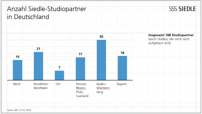
Siedle diagrams always have a white background. They are clear and reduced to reflect the essential statement. Diagram labels are black. Columns, bars, rings etc. can – depending on the content – be implemented in grey and/or blue tones. Ring diagrams are used instead of circle diagrams or pie charts. Decisive contents of a slide are set off in blue.
Examples
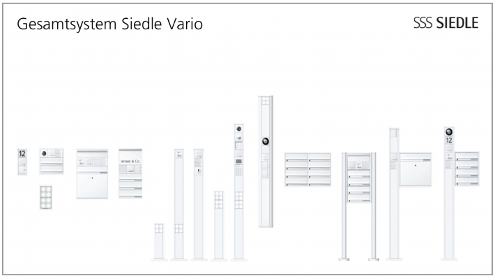
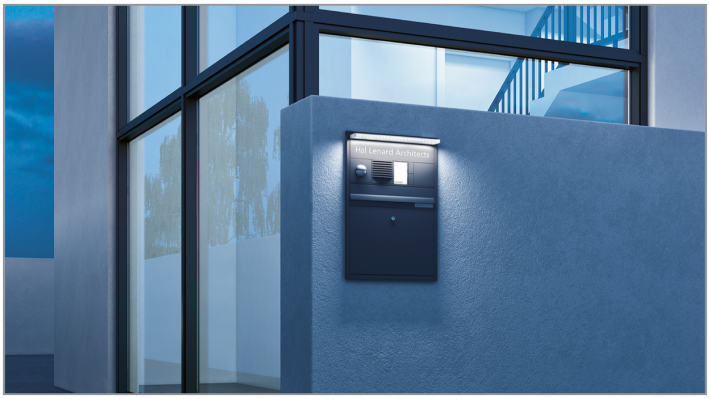
One or more images can be inserted into content as an eye-catcher. Images should preferably be placed side by side and separated by a white bar (distance between two units). They are suspended downwards from the “clothes line”.
The images should be in JPEG format with a resolution of 192 dpi. A single image on a content slide should not be less than 6 units wide and 4 units high (414 x 222 pt). Do not use more than 6 images on any one slide.
Pure text slides can be set to 1, 2 or 3 columns. 1-column texts have a width of 8 units (846 pt).
As a general principle, less text is better than too much. This is either represented by a bullet point (•) or visually structured by paragraphs.
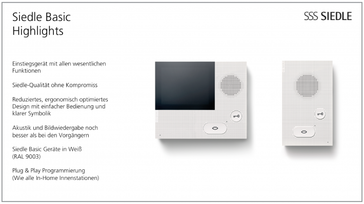
Texts and images are frequently combined on one slide. Within a presentation all pictures are on the left and all texts on the right or vice versa!
Each PowerPoint presentation ends with a concluding slide.